COVID Graphs
Daily COVID Graphs
In March 2020 Johns Hopkins University in Baltimore started publishing daily raw COVID timeseries and many websites and news outlets began graphing the data to make people around the world aware of the developing epidemic.
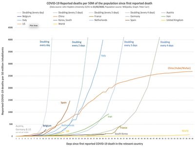
At the time, most published graphs plotted absolute COVID-19 cases per country and people understandably started making incorrect comparisons based on such graphs. I decided that graphs adjusted by the population of the country (or state in the case of Hubei/Wuhan) would provide a much clearer message but as I could find no such graphs, I decided to produce these myself - initially just for reported deaths as a more reliable measure than the number of infected cases which depended heavily on the wildly varying levels of testing. The daily scaled graphs provided an interesting (and shocking) comparison of the developing mortality curves across the affected countries and I received many requests to add additional countries as the epidemic became a pandemic.
I added similarly scaled graphs for the reported number of tests performed (using raw data from Our World In Data) and the reported number of COVID-19 cases (using raw data from Johns Hopkins University).
Note that the expected monotonic increase of the cumulative data sometimes contains a downward glitch caused by changes to the way that the data was collected and/or reported by various goverments.
The graphs were produced throughout the pandemic from March 2020 until September 2021 and can be seen on our Facebook page.

The first graph of scaled deaths, 22/03/2020
Copyright © 2001 - 2026 Carr Consulting. All Rights Reserved. Privacy Policy.